For almost everyone born in the last half-century, it’s hard to imagine a time before we knew exactly what the Earth looked like. Any map created in our lifetime has had actual photographs of the Earth for reference, so it’s pretty hard to get them wrong. Even for our parents and grandparents who lived before the Space Age, modern cartography had become extremely precise, and maps from their time look more or less the same as the ones we have today.
Is That Middle-Earth?
But in the Medieval period, before people had refined and developed accurate mapmaking techniques, maps looked a lot different. Obviously, medieval cartographers hadn’t seen photos of the Big Blue Marble. Heck, they hadn’t even explored the majority of the world! That, coupled with dubious scientific authorities and intense religious oversight, means medieval maps of the world were more fiction than reality.
One Map to Rule Them All
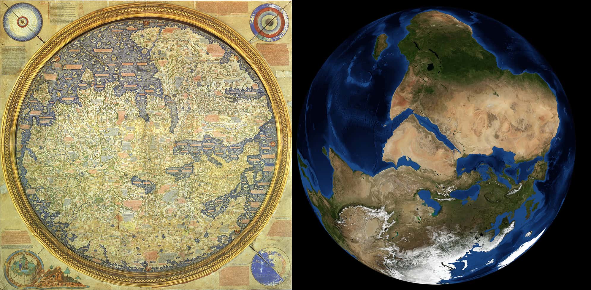
One Medieval map, however, was far better than any of the rest. Created around 1450, the Fra Mauro Map, named after its creator, was not only more accurate, more detailed, and more useful than the world maps that preceded it, it also fundamentally changed mapmaking forever and paved the way to a better understanding of the world we live in.
To modern eyes, it still looks extremely inaccurate...and it is, compared to modern maps. But based on what Fra Mauro had to work with, the thing is a masterpiece.
Help Us Fra Mauro, You’re Our Only Hope
Fra Mauro made his map for the rulers of Venice and Portugal, two crazy-rich seafaring nations who had the motive and the money to produce an extremely accurate world map. Note the latter: money. That was important. The rulers of Venice and Portugal weren’t about skimp on the extravagances.
Fra Mauro spared no detail, and it took him and a small army of cartographers several years to complete their project. Though he originally made two, only the Venetian version survives, and it is magnificent.
That’s a Nice Map You’ve Got There
Spanning 2.4 meters square, the Venetian map is made of the finest vellum (like paper, but made of animal skin) and mounted in an ornate frame. Despite the fact that fancy pigments could be seriously expensive in those days, the map features vibrant blues, reds, turquoises, and greens. Cartographical significance aside, the Fra Mauro Map is just plain beautiful to look at.
But I’m not just here to talk about a very pretty map. The Fra Mauro map isn't amazing just because it looks nice. It’s amazing because of just how thorough it is. In a time when barely any Europeans had traveled beyond their own continent, when most of them still figured lands like Africa and China were largely mythical, Fra Mauro presented the world as it had never been seen before—and he kinda nailed it.
The World As You’ve Never Seen It Before
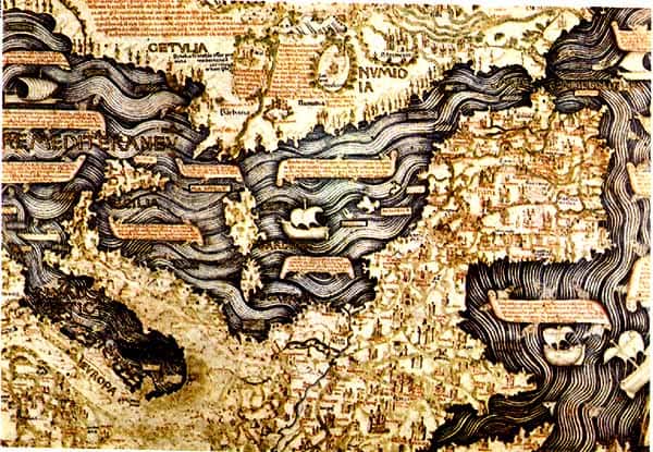
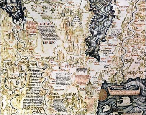
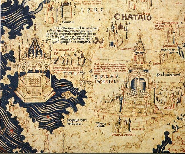
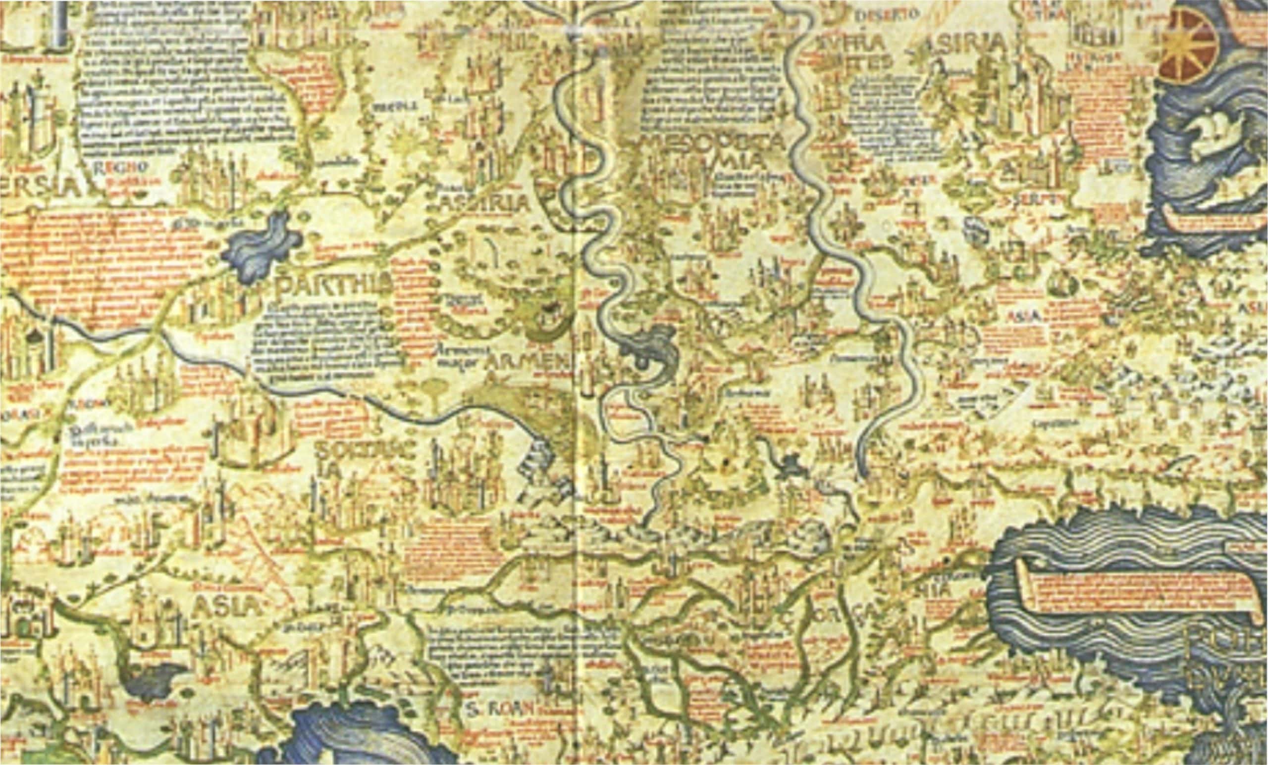
The Fra Mauro map has tons of details that you just don’t see on other Medieval maps. It includes Asia, even distinguishing real cities as far off as Beijing. Fra Mauro also detailed the Indian Ocean world, including Sri Lanka, Java, and Sumatra, with surprising accuracy. He also showed Africa down to the Cape of Good Hope.
He even included Japan (which he labeled as Cipangu, an extremely early name for the island nation), making him probably the first European mapmaker to do so. In fact, all of these were pretty much unheard of before Fra Mauro. And throughout, he included detailed annotations about the places he showed. By the time he was done, there were about 3,000 of these little notes. No one had ever even attempted to be this detailed in portraying the world we live in.
Pobody’s Nerfect
Now, obviously, the map wasn’t perfect. It features seven-headed serpents, troglodytes, sea monsters, and lakes that can turn iron into gold. You don't see many of those on maps today. The shapes of the continents also clearly leave a little to the imagination, and some places are a lot more detailed than others.
But still, considering the resources that Fra Mauro had at his disposal, it’s honestly a staggering piece of work. Most medieval maps bear almost no resemblance to the world as we know it—but if you look at the Fra Mauro map, you'll notice that nearly everything is in its right place. So how exactly did he do it?
Well, he had two things going for him. Firstly, as I said, he had the financial backing of two of the richest nations on Earth. That certainly helps. Secondly, Fra Mauro happened to be in the perfect place to learn about the world at large: Venice.
A Beer for Your Stories
During Fra Mauro's lifetime, Venice was a global trading hub. Sailors from all over the world congregated in the City of Bridges, and when they pulled up to the docks, Fra Mauro was there to offer them a beer and a meal for their stories. He was no Marco Polo; he didn’t explore these places himself, but he was apparently a very good listener.
Unlike other map-makers, who would only take accounts from the distinguished Marco Polos of the world, Fra Mauro would talk to anyone. From devout pilgrims to crude sailors, Fra Mauro took any story he could find. But that's not to say he listened to any drunk's tall tales and took them as fact. He looked at all of these accounts critically and used them to form an image of the world that was, as best as he could tell, as accurate as possible.

Up Is Down, Down Is up
Aside from the obvious scale and grandeur of the map, Fra Mauro’s critical eye is what really sets it apart. Take, for instance, the map's weird orientation. One of the first things you notice when you look at the map is that it’s upside down. South is at the top. But to a Medieval European, it wouldn’t have been upside down—it actually would have been on its side.
That’s because most other European maps at the time had east at the top. Why? Well, the Church said that the Garden of Eden, the most important place on Earth, was far off to the east. So, of course, mapmakers put Eden at the top of their maps and went down from there.
Fra Mauro, on the other hand, took far more inspiration from Arab cartographers, whose methods were more scientific. And since Arab maps generally had south at the top, so too did Fra Mauro’s.
Bible Stories
That may seem like a small difference, but it really means everything. Before Fra Mauro, maps of the world weren’t based on experience and observation. They were based on the Bible, ergo the Eden-centric orientation.
While Fra Mauro’s map does include Eden, it’s off to the side, not actually on Earth. Fra Mauro was going off the accounts of the sailors he spoke to. They had been to many fantastic places, Africa, India, China, and beyond, but believe it or not, none of them had been to the Garden of Eden. At least not the ones who Fra Mauro found trustworthy.


Sign up to our newsletter.
History’s most fascinating stories and darkest secrets, delivered to your inbox daily. Making distraction rewarding since 2017.
Do the Work
Now, I’m sure many other European mapmakers out there had similar information as Fra Mauro. I’m sure not all of them believed that the Garden of Eden was actually out there in the far east, either. But still, none of them dared to challenge the Church, and so they kept churning out these biblical maps.
But while Venice and Portugal were still extremely devout states, they had another master: again, money. They were nations of merchants, and they stood to make a lot more profit if they had an accurate understanding of the world, Church or no Church. To this end, they hired Fra Mauro, who clearly had an extremely scientific mind. His emphasis on empirical observation and his willingness to challenge traditional beliefs, all mainstays of scientific thought today, were radical.
One Heck of a Map
So while it's still easy to look at the Fra Mauro map and chuckle because he got the shapes all wrong, or because he included sea monsters, remember, this guy didn't have Google Earth. All he had were the stories of drunken sailors and pompous explorers—as well as the work of his team of cartographers—and he somehow managed to cobble them all together and make one heck of a map.


.jpeg)